Why Every Brand Looks the Same Now (And Why That's a Problem)

Why Every Brand Looks the Same Now
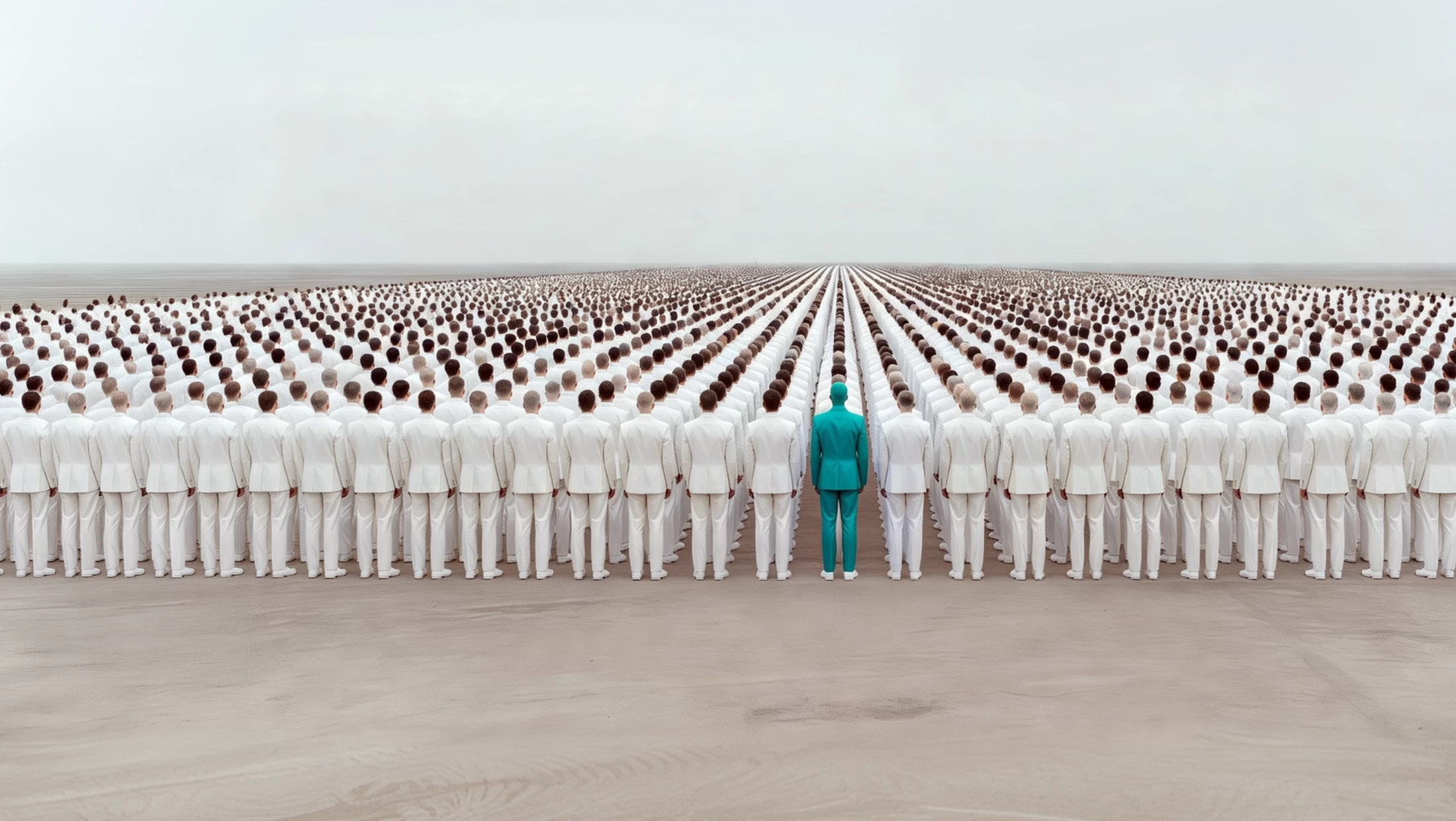
Take a moment to think about the last ten company websites you visited. They may have operated in completely different industries, served different audiences and sold entirely different products, yet there's a good chance they all felt surprisingly similar. Clean sans-serif typography, muted colour palettes, generous white space, soft gradients and minimalist logos have become so commonplace that many modern brands are beginning to blur into one another.
It's a strange contradiction. Businesses spend enormous amounts of time and money trying to differentiate themselves from competitors, yet many end up adopting exactly the same visual language as everyone else. In the pursuit of looking modern, professional and trustworthy, they've unintentionally become forgettable.
This isn't an argument against good design. Far from it. Modern branding has brought genuine improvements in accessibility, usability and consistency across digital platforms. The problem is that somewhere along the way, many businesses stopped asking a much more important question: does our brand actually look like us?
That distinction matters because branding has never simply been about aesthetics. A brand exists to create recognition, build trust and leave a lasting impression. If customers struggle to distinguish your business from half a dozen competitors, even the most polished design has failed to achieve its primary objective.
So how did we get here?
From Personality to Predictability
To understand why so many brands now look alike, it's worth looking at how branding has evolved over the past twenty years.
At the turn of the century, websites were often chaotic by today's standards. Designers embraced glossy buttons, drop shadows, textured backgrounds and decorative typography. Looking back, much of it feels dated, but it also reflected a period when businesses were experimenting and trying to establish unique identities online.
As digital experiences matured, tastes changed. Broadband connections improved, smartphones arrived and websites needed to work across dozens of different screen sizes. Simplicity became more than a design preference—it became a practical necessity.
Minimalism solved real problems. Cleaner layouts loaded faster, typography became easier to read and simplified logos performed better across websites, apps and social media profile pictures. Brands stripped away unnecessary decoration and focused on clarity instead.
It was, in many ways, a positive evolution.
The challenge came when minimalism stopped being a design principle and became a formula.
Rather than asking what visual identity best represented their business, many organisations began copying whatever appeared to be working elsewhere. As more companies adopted the same aesthetic, originality quietly gave way to conformity.
The Influence of Silicon Valley
Few industries have shaped modern branding as profoundly as technology.
During the rise of companies such as Apple, Google, Airbnb, Spotify and countless software startups, a new visual language emerged. Interfaces became cleaner, logos became flatter and typography became simpler. White space was no longer considered empty; it became a sign of confidence. Colour palettes became more restrained, while user experience replaced visual complexity as the measure of good design.
There were good reasons for this shift. Digital products needed to be intuitive, scalable and accessible. Simplicity made interfaces easier to navigate and reduced unnecessary distractions.
The problem wasn't that technology companies embraced this philosophy. It was that businesses in entirely unrelated sectors began adopting it without asking whether it suited their own brand.
Law firms started looking like software companies.
Construction firms borrowed the visual style of fintech startups.
Luxury retailers adopted the same stripped-back identities as mobile apps.
Healthcare providers embraced branding that could easily have belonged to an AI platform.
The result is a marketplace where businesses with completely different personalities often present themselves in remarkably similar ways.
Ironically, companies that once stood out because they were original have inspired thousands of brands to become indistinguishable from one another.
Has Minimalism Gone Too Far?
Minimalism is often misunderstood as the removal of everything interesting.
In reality, the best minimalist brands are anything but bland. Apple's branding works because every decision is intentional. The simplicity isn't a shortcut; it's the result of extraordinary attention to detail. Every proportion, every photograph, every animation and every word has been carefully considered.
Problems arise when businesses imitate the appearance of minimalism without adopting the thinking behind it.
A generic sans-serif font doesn't create a premium brand.
Neither does a monochrome logo or a white background.
Those are visual tools, not a strategy.
Great branding begins by understanding who you are, who your customers are and how you want people to feel when they encounter your business. Only then should design become part of the conversation.
Too often, companies reverse that process. They begin by collecting screenshots on Pinterest, browsing design galleries or asking an AI tool to generate a logo that looks "modern". The end result may be aesthetically pleasing, but it often lacks character because it was built around trends rather than identity.
That distinction is becoming increasingly important in a world where consumers are exposed to thousands of brands every day. Familiarity builds trust, but sameness rarely builds loyalty.
The Rise of AI and the Risk of Creative Sameness
Artificial intelligence has undoubtedly transformed the creative industry. Tasks that once took days can now be completed in minutes, allowing designers to explore concepts, generate imagery and test ideas at a speed that would have been unimaginable only a few years ago. Used intelligently, AI is becoming one of the most powerful creative tools ever developed.
However, it also introduces a challenge that many businesses haven't yet considered.
AI learns from existing work. It analyses millions of logos, websites, advertisements and brand identities before producing something that statistically resembles a good solution. The problem is that if the internet is already saturated with similar design styles, AI naturally reinforces those patterns rather than challenging them.
Ask an AI platform to create a "modern technology website" and you'll probably receive a clean layout with rounded cards, a blue gradient, minimalist icons and a geometric sans-serif typeface. Ask it to design a logo for a finance company and there's a good chance it will suggest another abstract symbol accompanied by a familiar-looking font.
The results are often polished, but polish and originality are not the same thing.
This doesn't mean AI is making branding worse. It simply means that businesses can no longer rely on aesthetics alone to differentiate themselves. If everyone has access to the same tools and the same visual references, creativity shifts from execution to thinking. The brands that succeed in the coming years won't necessarily be those using the most advanced software—they'll be the ones asking the best questions.
The Difference Between Following Trends and Building a Brand
Design trends have always existed. Every decade has its defining characteristics, and there's nothing inherently wrong with embracing contemporary design principles. Problems arise when trends become the foundation of a brand rather than an influence on it.
The strongest brands don't ask, "What does everyone else look like?"
They ask, "How do we want people to remember us?"
Those are very different questions.
A memorable brand isn't simply recognised because of its logo. It's recognised because every interaction reinforces the same identity. The colours, typography, photography, language, tone of voice and customer experience all work together to create something distinctive.
Think about some of the world's most recognisable brands. You don't need to see their logo to know who they are. A single colour, a style of photography or even the way they write can be enough to identify them instantly.
That's what effective branding achieves.
It creates recognition before the logo even appears.
Businesses often become obsessed with visual identity while overlooking the countless other elements that shape perception. Branding isn't confined to a logo or a website; it's present in every email, every social media post, every proposal, every customer interaction and every piece of communication your audience experiences.
When those elements are consistent, a brand becomes familiar.
When they're distinctive, it becomes memorable.
Looking Professional Isn't the Same as Looking Different
One of the reasons so many businesses end up with similar branding is fear.
Standing out feels risky.
Choosing an unconventional colour palette, a more expressive tone of voice or a distinctive visual identity can feel uncomfortable, particularly in industries where everyone else looks the same. Many business owners worry that being different could make them appear less credible.
Ironically, the opposite is often true.
Consumers are exposed to thousands of marketing messages every day. Our brains naturally filter out anything that feels predictable because we've seen it before. Distinctive brands interrupt that pattern. They create curiosity. They encourage people to pause, look again and remember what they've just seen.
Of course, standing out doesn't mean being different for the sake of it. A law firm probably shouldn't brand itself like a children's toy company, and a luxury jeweller shouldn't communicate like a discount retailer. Distinctiveness still needs to be appropriate for the audience you're trying to reach.
The objective isn't to shock people.
It's to create a brand that couldn't easily belong to anyone else.
The Cost of Looking Like Everyone Else
When every competitor looks broadly the same, purchasing decisions become increasingly difficult for customers. If two businesses appear equally credible, offer similar services and present themselves in almost identical ways, price often becomes the deciding factor.
That's a dangerous position to occupy.
Competing on price is rarely sustainable, particularly in service-based industries where expertise, trust and relationships are the real differentiators.
Strong branding changes the conversation. It allows businesses to compete on value rather than cost because customers perceive them as unique rather than interchangeable.
That's why branding should never be viewed as a cosmetic exercise.
Done properly, it's a commercial advantage.
It helps customers remember you, recommend you and choose you, even when cheaper alternatives exist.
The CYB3R Perspective
At CYB3R Media, we believe good design should never be confused with good branding.
A beautiful website or an elegant logo might capture attention for a moment, but they won't build a lasting business unless they're rooted in strategy. Before we think about colours, typography or layouts, we focus on understanding what makes a business genuinely different. What problem does it solve? Why should customers trust it? What should people remember after their first interaction?
Those answers shape every creative decision that follows.
We don't believe brands should chase trends simply because they're fashionable. Trends come and go, but a clear identity has the power to endure. The businesses that achieve long-term success are rarely the ones that look like everyone else. They're the ones that have the confidence to communicate who they are with clarity, consistency and originality.
Final Thoughts
Modern branding has become cleaner, more accessible and more refined than ever before. Those are positive developments, and they have helped create better digital experiences for millions of people.
But refinement should never come at the expense of recognition.
If your branding could easily be mistaken for that of five competitors, it may be time to step back and ask a simple question: are you creating an identity that's genuinely yours, or are you borrowing one that already belongs to the market?
The brands that people remember aren't always the loudest, the most colourful or the most unconventional.
They're the ones that know exactly who they are—and aren't afraid to show it.
Ready to Build a Brand That Stands Apart?
If your business feels like it's blending into the crowd, it might be time to rethink more than just your logo.
At CYB3R Media, we create brands, websites and digital experiences that are built around strategy, not trends. We help businesses define what makes them different and turn that into a distinctive identity that customers remember.
Book a free brand consultation today and discover how strategic branding can help your business stand out for all the right reasons.